Brand, looks and footer credits
Set the wordmark, the mark and the brand colour, let the site draw its own icons and share image, choose a look for the public pages and add your credits to the footer.
Updated 9 Oct 2026 · written for Launch Lab 2.9.0
On this page
Open Brand under Tools in the admin sidebar. This one screen holds your wordmark, your mark and your colours, and everything a visitor sees of the brand, from the browser tab to a shared link, is drawn from what is saved here. The look of the public pages and the credits at the bottom of the footer are two tabs of Site Settings, covered further down.
Set up your brand#
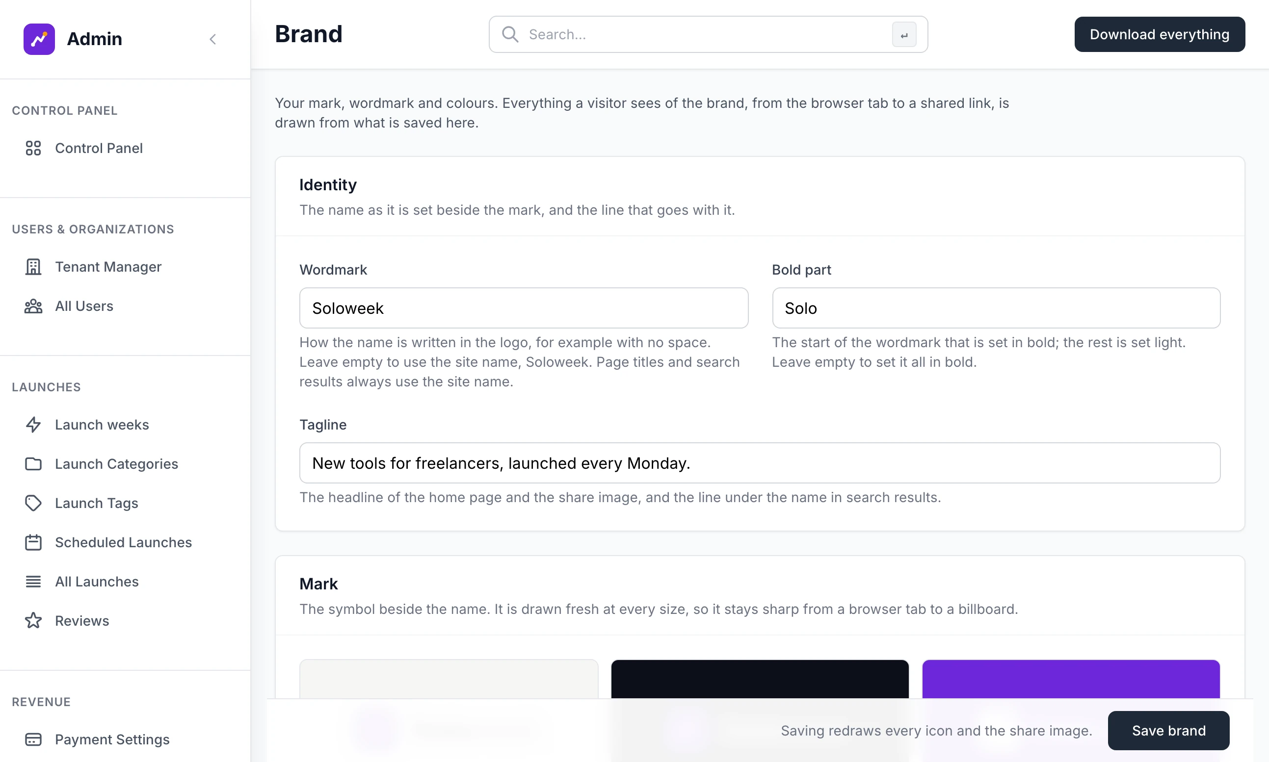
Step 1: Write the wordmark
Under Identity, type the name as the logo should spell it into Wordmark, for example
Soloweek. Type the start of it into Bold part, for exampleSolo. That part is set in bold and the rest light.Step 2: Upload a mark
Under Mark, choose an SVG file in Upload a mark. The mark lists what the file must be.
Step 3: Choose the colour
Under Colour, click one of the fourteen swatches or type a hex colour into Brand colour. Add an Accent if your mark has a node. The Readability list beside them grades the choice as you make it.
Step 4: Check it on the site
Scroll to On the site. It shows your real site in the colours you chose, before anything is saved, as Home or Coming soon and as Desktop or Phone. A new mark or wordmark shows only after saving.
Step 5: Click Save brand
You see "Brand saved. It is live on every page." Saving also redraws every icon and the share image.
Identity#
Wordmark: how the name is written beside the mark. Leave it empty to use the site name. Page titles and search results always use the site name.
Bold part: must be the start of what you typed into Wordmark, or you see "The bold part must be the start of the wordmark." It needs the Wordmark box filled in, even when the wordmark is the same as the site name. Leave it empty to set the whole wordmark in bold.
Tagline: the headline of the home page and the share image. It is the same field as Tagline on the General tab of Site Settings.
The mark#
The mark is the symbol beside the name. It is kept as a line drawing and drawn fresh at every size, with a heavier line when it is small. The file must meet these rules:
| Rule | Detail |
|---|---|
| An SVG file | The name ends in .svg, it is under 20 KB, and it has no document type line. |
A viewBox | Draw on a 24 by 24 grid: viewBox="0 0 24 24". Any other viewBox is scaled and centred onto that grid. |
| Plain shapes | Paths, circles, ellipses, rectangles, lines, polylines and polygons, in groups if you like, up to 200 in all. Text, pictures, gradients and anything else are dropped. |
| Geometry only | Colours, fills and line widths in the file are ignored. Every shape is drawn as a line with rounded ends, in one colour. |
| Two classes | A shape with class="ink" is filled solid. A shape with class="node" is filled in the accent colour. |
This is the mark in the kit's brands/example folder: a line, a solid dot and an accent dot.
<svg xmlns="http://www.w3.org/2000/svg" viewBox="0 0 24 24" fill="none" stroke="#0c0f1a" stroke-width="2.4" stroke-linecap="round" stroke-linejoin="round">
  <path d="M6 18 V11 A6 6 0 0 1 12 5 H13"/>
  <circle class="ink" cx="6" cy="18" r="2.2" fill="#0c0f1a" stroke="none"/>
  <circle class="node" cx="17" cy="5" r="2.6" fill="#fbbf24" stroke="none"/>
</svg>
The site always shows the mark on a rounded tile: a tile in the brand colour with a white mark and the node in the accent, or a white tile with a dark mark where the background is the brand colour itself.
A site with no mark shows a logo image. While there is no mark, the screen has a second box, Or use a logo image, for a square PNG of at least 256 pixels, and the favicon is made by shrinking it. A PNG or JPG offered as a mark is refused with "The mark must be an SVG file. To use a PNG or JPG, upload it as a logo image instead." To go back from a mark to a logo image, tick Remove the mark and go back to a logo image and save.
Colour#
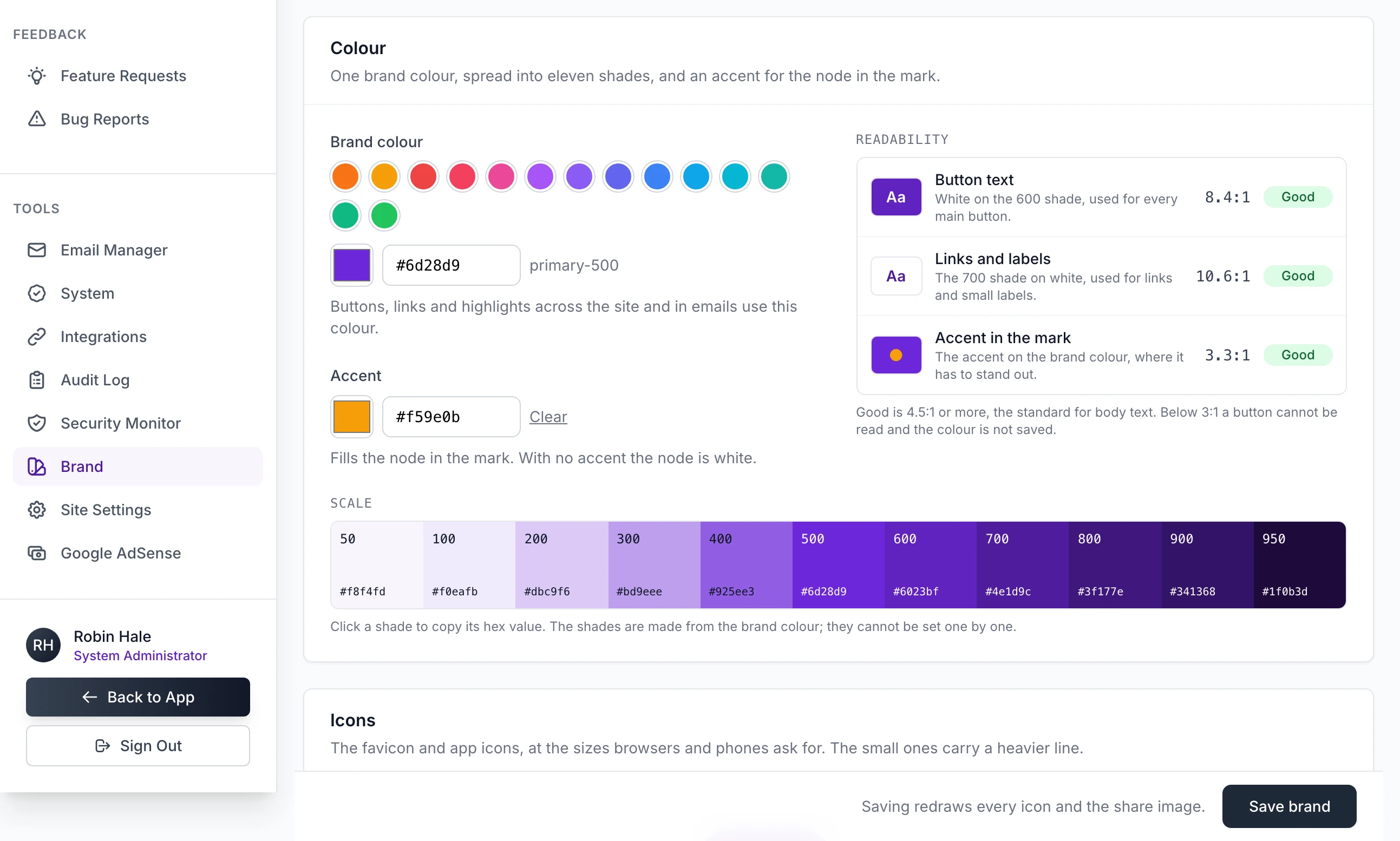
Brand colour is one colour. The site spreads it into eleven shades, from 50 to 950, shown under Scale. Click a shade to copy its hex value. The shades cannot be set one by one. Buttons are the 600 shade with white text, and links and small labels are the 700 shade.
Accent fills the node in the mark and nothing else. With no accent the node is white. Clear empties it.
Readability measures the contrast of the pairs that have to stay legible:
| Row | What is measured | Grades |
|---|---|---|
| Button text | White on the 600 shade | Good at 4.5:1 or more, Weak from 3:1, Too low under 3:1 |
| Links and labels | The 700 shade on white | The same three |
| Accent in the mark | The accent on the brand colour. Shown only when there is an accent | Good at 1.5:1 or more, otherwise Weak |
A Weak colour is saved. Several of the swatches are Weak for button text, the orange a new site starts with among them. When button text is below Good, a line under the list offers the nearest darker colour that reaches it, as a link reading "Use" and the colour.
The files it draws#
Each time you save a brand that has a mark, the site draws these files. They are listed under Downloads, each with a Download link.
| File | What it is |
|---|---|
mark.svg | The mark on its tile, as a vector |
favicon.svg, favicon.ico, favicon-16.png, favicon-32.png | The browser tab icon. The .ico file holds 16, 32 and 48 pixels |
apple-touch-icon.png | The iPhone home screen icon, 180 pixels |
icon-192.png, icon-512.png, icon-maskable-512.png | App icons. The last is the one Android may crop to a circle |
lockup-paper.png, lockup-ink.png, lockup-primary.png | The mark and wordmark together, for light backgrounds, dark backgrounds and the brand colour |
og-default.png | The share image, 1200 by 630 pixels |
The share image is what appears when a link to your site is posted or sent. It carries the mark, the wordmark, the tagline and the site's address, taken from Site URL. To use a picture of your own, upload it under Share image in Use your own image instead. A listing's page uses that listing's first image when it has one. In the lockups and the share image the wordmark is always set in Geist, whichever typeface the site uses.
Download everything at the top of the screen, and Download everything as a zip under the list, give you one zip named after your site, such as soloweek-brand.zip. It holds every file above and a kit folder with brand.json and mark.svg.
Brand kits#
A brand kit is the whole brand as a file, to keep or to apply to another site. Both buttons are in Brand kit at the bottom of the screen.
Export brand.json downloads the wordmark, the bold part, the tagline, both colours, the typeface, the home page heading style and the mark. It holds no image files: they are drawn again wherever the kit is applied.
Import a brand.json with Apply replaces whatever the file names and leaves the rest. You see "Brand kit applied. It is live on every page."
{
  "wordmark": "ExampleSite",
  "wordmark_lead": "Example",
  "tagline": "Something new, launched every week.",
  "primary": "#2563eb",
  "accent": "#fbbf24",
  "typeface": "geist",
  "hero_style": "statement"
}
Every key is optional. typeface is inter, geometric, serif or geist, and hero_style is compact or statement: applying a kit that names them changes those two choices on the Appearance tab. The mark is either a mark key holding the SVG as text, which is how the screen exports it, or a file called mark.svg in the same folder.
From the terminal#
Run these in the Launch Lab folder, set up as in Install Launch Lab on your computer.
flask --app run.py brand import brands/my-brand
flask --app run.py brand export brands/my-brand
flask --app run.py brand render
brand importtakes a folder holdingbrand.jsonandmark.svg, or a singlebrand.jsonfile. It applies the kit, draws the files and prints what it applied, ending "Wrote 14 image files."brand exportwrites the site's brand into the folder asbrand.jsonand a separatemark.svg. The screen's Apply takes one file only, so a kit exported this way and imported on the screen arrives without its mark.brand renderdraws every file again from the saved mark. On a site with no mark it says "This site has no mark yet. Add one in Admin > Brand or import a kit."
On a server set up with the deploy script, one command copies the kit's brand.json and mark.svg into the site's data and applies them inside the site's container. Use your site's name in place of NAME:
scripts/deploy.sh brand NAME brands/my-brandLooks#
Open Site Settings under Tools and click the Appearance tab. A look is a named set of five choices about the public pages. Click a look to set all five, then change any one of them on its own.
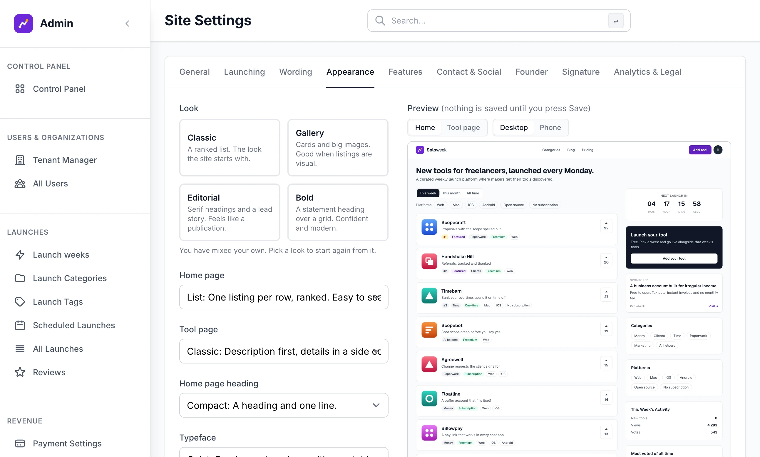
| Look | Home page | Listing page | Home page heading | Typeface | Corners |
|---|---|---|---|---|---|
| Classic | List | Classic | Compact | Inter | Soft |
| Gallery | Card grid | Showcase | Compact | Manrope | Round |
| Editorial | Magazine | Classic | Statement | Serif headings | Sharp |
| Bold | Card grid | Showcase | Statement | Manrope | Soft |
A site starts on Classic unless you picked another look in the setup wizard. The five parts are:
Home page: List is one listing to a row, ranked. Card grid is cards, three across. Magazine shows the top listing large and the rest as cards.
The listing page, labelled with your own word, as in Tool page: Classic puts the description first with the details in a side column. Showcase puts the images first and large.
Home page heading: Compact is a heading and one line. Statement is a large heading with the button to add a listing.
Typeface: Inter, Manrope, Serif headings over plain body text, or Geist.
Corners: Soft, Sharp or Round, which also makes buttons pill-shaped.
When your five choices match none of the four looks, no look is highlighted and the note reads "You have mixed your own. Pick a look to start again from it." The Preview beside the choices is your real site drawn with them. Switch it between Home and a listing page, and between Desktop and Phone. Nothing is saved until you click Save settings.
Footer credits#
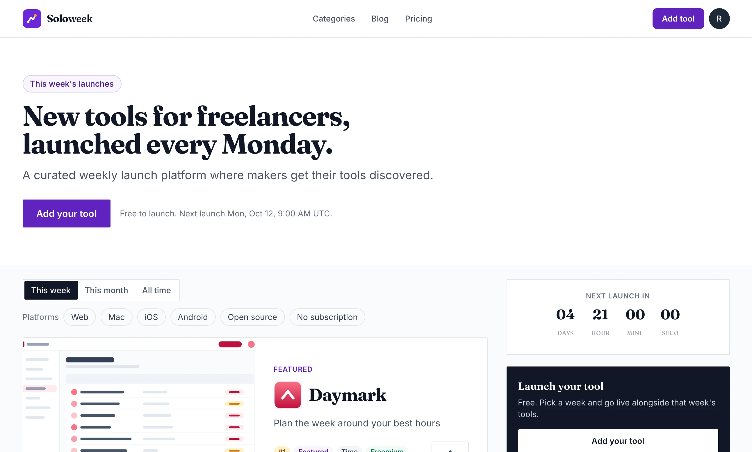
Click the Footer credits tab of Site Settings, called Signature before version 2.8.0. It holds two small credits for the very bottom of every page, under the copyright line. Each has its own switch, and nothing shows until one is switched on and filled in.
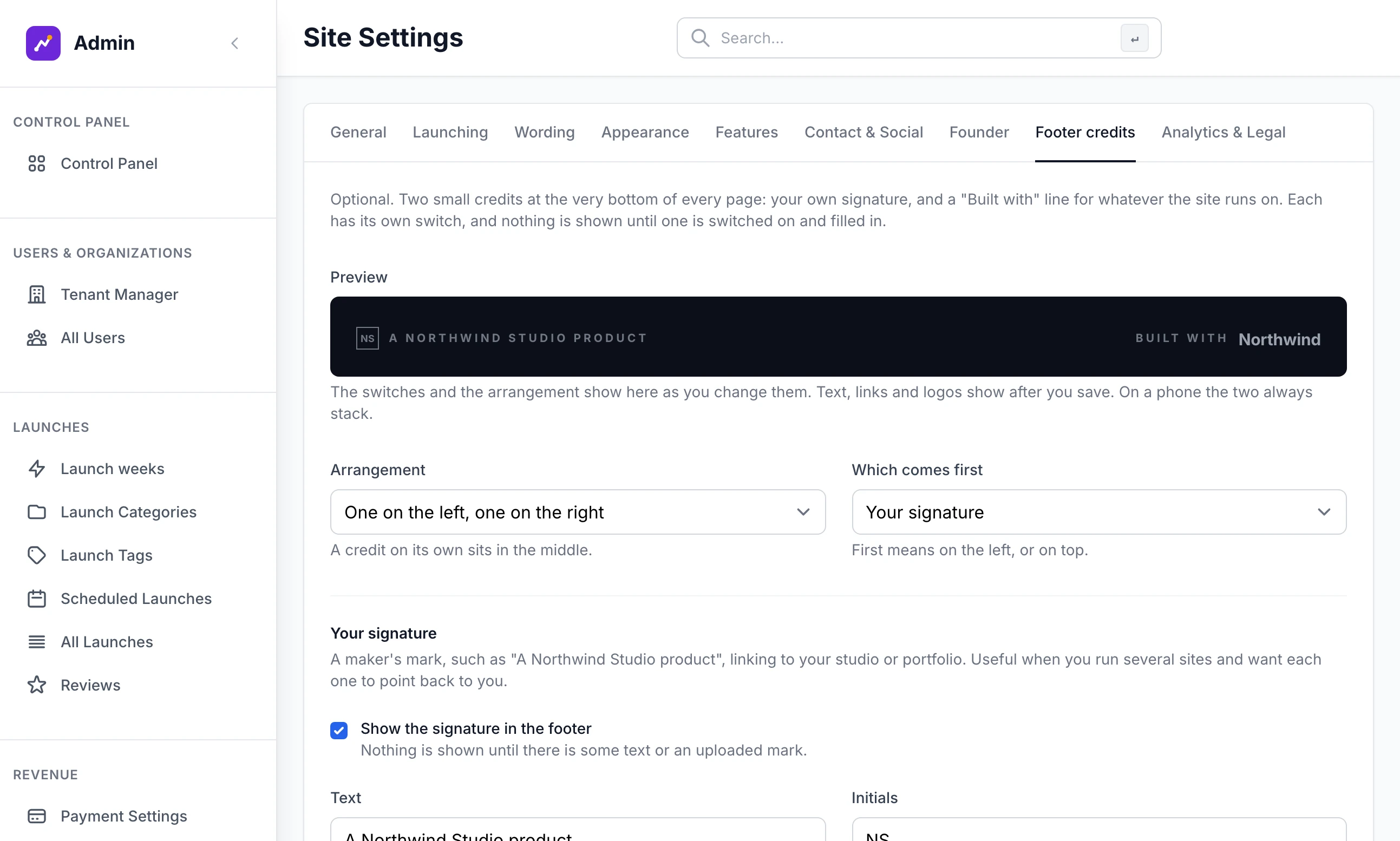
Your signature is a maker's mark such as "A Northwind Studio product", pointing back to you. Tick Show the signature in the footer, then fill in:
Text: up to 80 characters, shown in small capitals.
Initials: up to four letters, drawn in a small box before the text.
Links to: where a click goes. Leave it empty for no link.
Your own mark: an SVG or a transparent PNG, used in place of the text and initials. It is drawn about 21 pixels tall in the footer's text colour, whatever colours the file uses.
"Built with" credit is a second line for the platform, kit or agency behind the site. Tick Show the "Built with" credit in the footer, then fill in:
Words before the name: for example "Built with". Leave it empty to show the name or logo alone.
Name: shown after the words. With a logo uploaded the name is not shown, but screen readers read it out.
Links to: where a click goes.
Logo and Logo colours: the logo is drawn about 21 pixels tall in place of the name, in The logo's own colours or The footer's text colour, like the signature. A logo that keeps its own colours should be one made for a dark background.
Two boxes at the top arrange them. Arrangement is One on the left, one on the right, Side by side in the middle or One above the other. Which comes first decides which is on the left, or on top. A credit on its own sits in the middle, and on a phone the two always stack.
The Preview follows the switches and the arrangement as you change them. Text, links and logos show there after you click Save settings.
The line "Built by" and a name, above these credits, is not one of them. It comes from the Founder tab.
"The mark needs a viewBox, for example viewBox="0 0 24 24"."
The opening <svg> tag has a width and height but no viewBox. Export the file again from your drawing program with the viewBox kept, or add it by hand.
"The mark has no shapes in it. Draw it with paths, circles and rectangles."
Everything in the file was something the site drops. The usual causes are lettering left as text and shapes kept inside a symbol or a definitions block. Convert text to outlines and export plain shapes.
My filled logo came out as outlines
Fills in the file are ignored and every shape is drawn as a line. Add class="ink" to each shape that should be solid, and class="node" to the one that should take the accent colour.
"The signature mark must be an SVG, PNG or WebP image without scripts, under 200 KB."
The file for a footer credit was refused. An SVG must be under 200 KB and free of scripts. Save it again as a plain SVG, or upload a PNG.
Stuck on a step? Send a message.